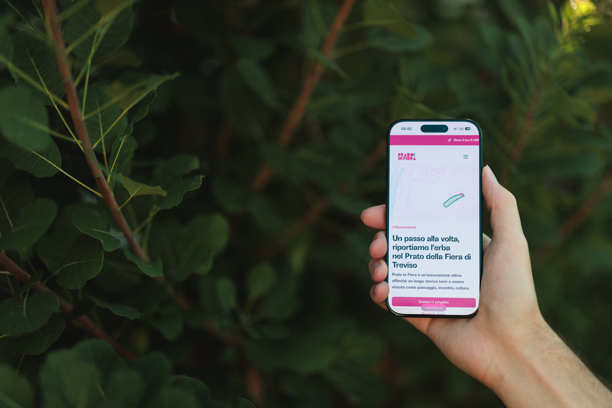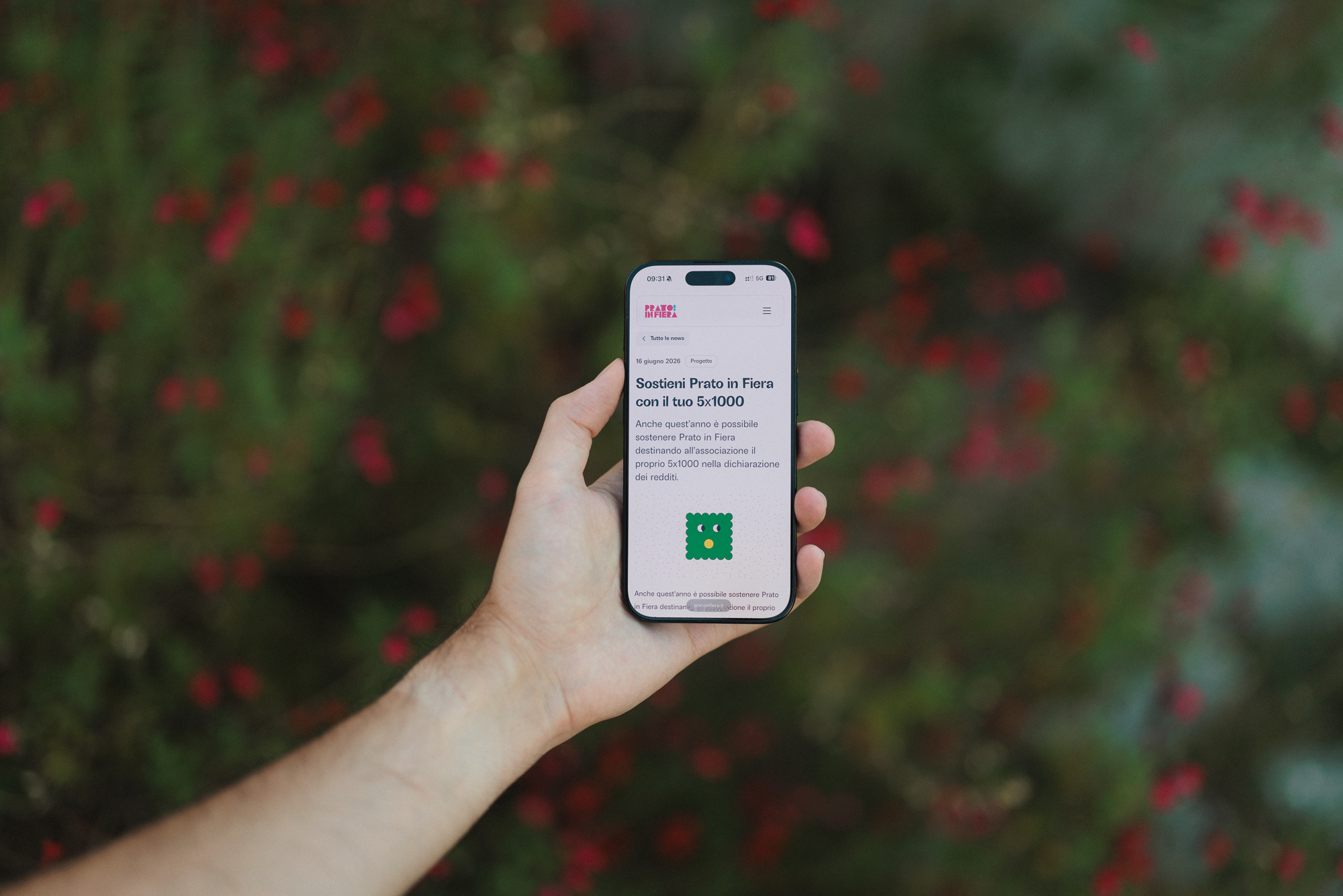
Prato in Fiera is an association working to restore the Prato della Fiera as a green, open and shared public space for the city of Treviso.
Over the years, the Prato has hosted an unusually broad range of activities: cultural events, workshops, games, sports, performances, cinema, music, yoga, public discussions and community gatherings. The association brings together citizens, volunteers, institutions and local organisations around the care and regeneration of the area.
The website needed to represent this diversity while making it easy for very different people to understand the project, discover what is happening and take part.
A website that also works as a tool for events and registrations
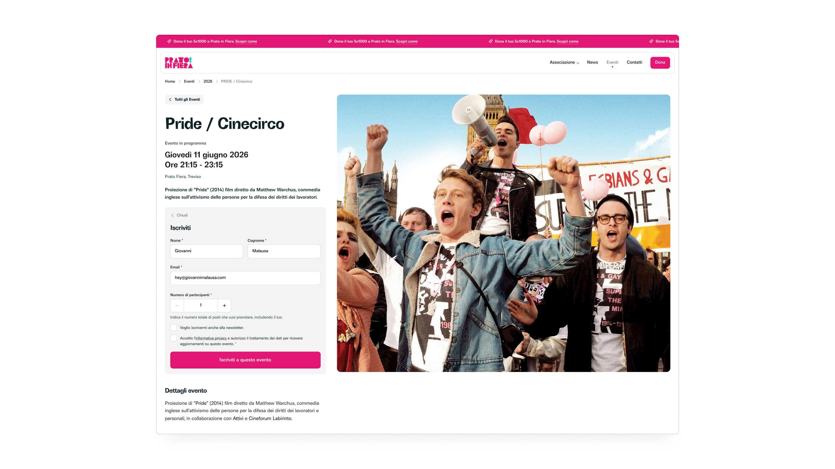
Events are a fundamental part of Prato in Fiera, so the project quickly extended beyond publishing information.
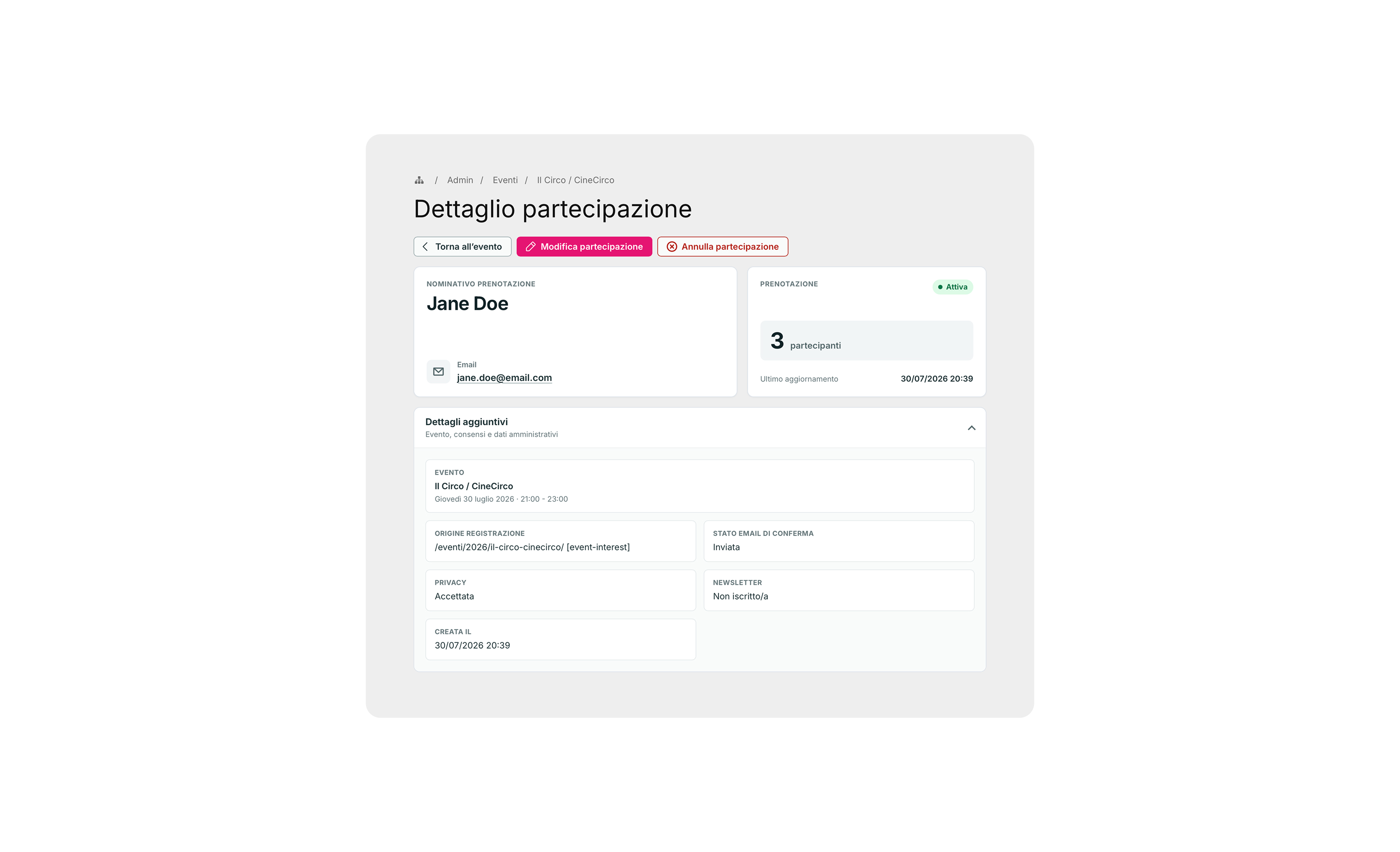
The website acts as an operational tool through which the association can create events, collect registrations and manage participants. Each event has its own information and registration flow, while the system keeps the public-facing experience connected to the organisational work happening behind it.
This makes the platform useful before, during and after an event rather than simply acting as a calendar.
Large, readable typography with an expressive visual voice
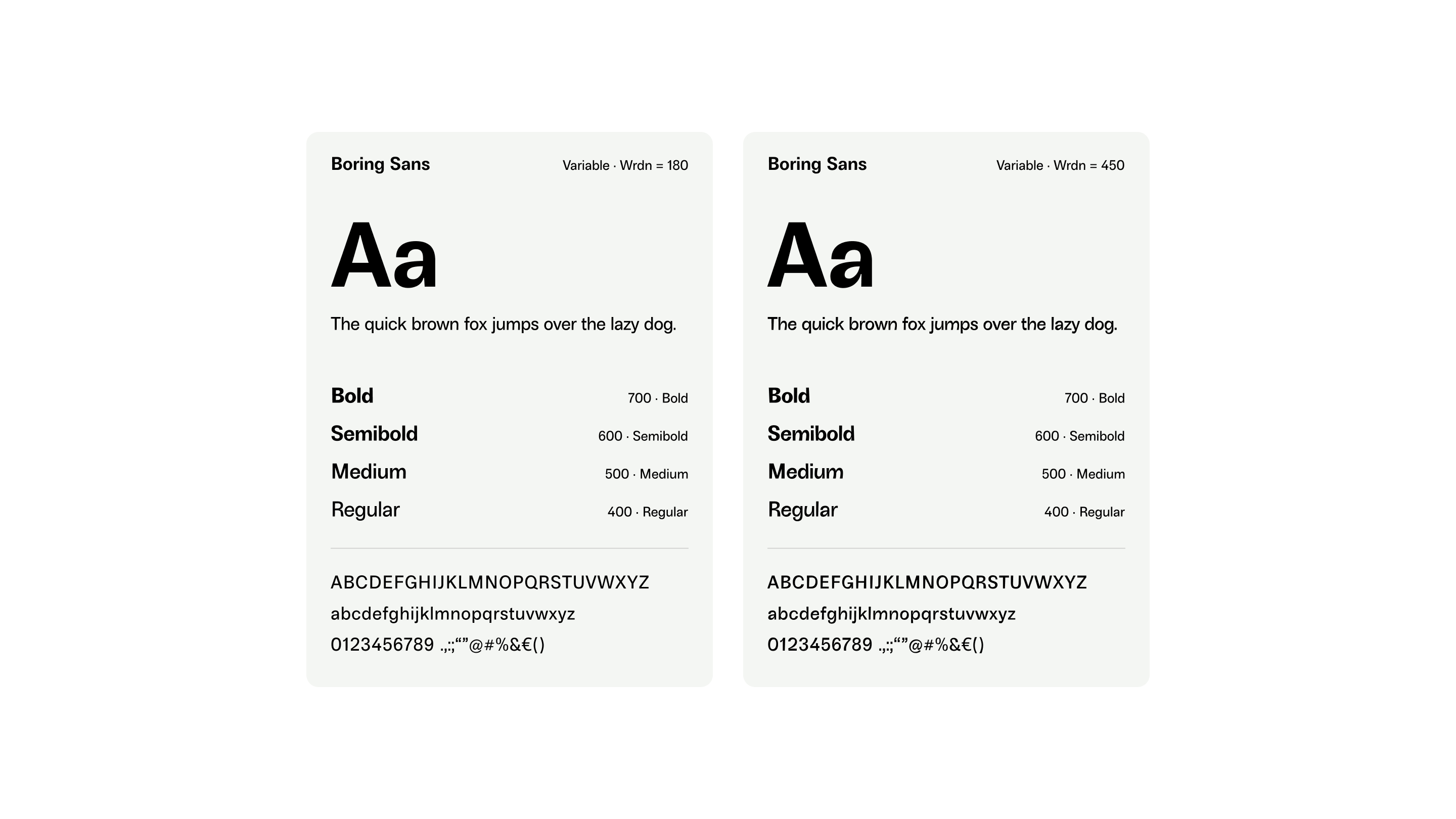
Large typography plays an important role throughout the interface, supporting readability while giving the visual identity a strong presence.
Boring Sans provides an interesting balance between these two needs. At its more neutral settings it works as a clear, highly legible sans serif; through its variable weirdness axis, the same typeface can become considerably more expressive.
This creates room for playful headings and graphic moments without sacrificing the clarity of body copy, navigation and functional interfaces.
Designed for the whole city, with usability as one of the main design principles
Prato in Fiera speaks to a remarkably broad audience: younger adults, families, volunteers, cultural organisations and elderly citizens all interact with the same platform.
Navigation is deliberately straightforward, information is organised through strong and predictable hierarchies, typography is generous and interfaces avoid unnecessary complexity. High contrast, clear interactive elements and comfortable reading sizes make the experience easier to navigate across devices and for users with very different levels of digital confidence.

The objective was a website that feels friendly and distinctive while remaining immediately understandable.
One system for communication, participation and growth
The final result combines the public role of an association website with the practical tools required to run its activities.
Events, registrations, participant communications, fundraising campaigns, news, sponsors and partnerships all live within the same digital ecosystem. For visitors, the experience remains simple and approachable. For the people running Prato in Fiera, the website becomes part of the infrastructure behind the project itself.